Back when I worked in the fashion industry, a big part of my job was to create textile prints and render them in several color palettes. I thought I was pretty good at it, until one day the designer I worked with came into my office and flung a pile of my textile prints onto my desk. "Your color palettes really suck. Try again." Then he turned around and walked out.
Umm... ok? No advice or guidance, just an insult delivered in a condescending voice. By then I had developed the thick skin needed for working in fashion, but the comment still hurt. I decided it was time to study up on color combinations.
Every class, book and magazine article I've read about color theory tells you to begin with the color wheel. I suppose that is helpful if you never got to see one in elementary school, but I'd like to go beyond the primary, secondary and tertiary colors. Let's look at some real examples.
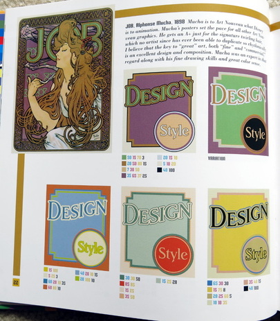
I turned to a book on the shelf my co-worker had bought. "The Designers Guide to Color Combinations" by Leslie Cabarga. It features advertisements from the early to mid 20th century rendered in various color palettes. Here is a sample page.
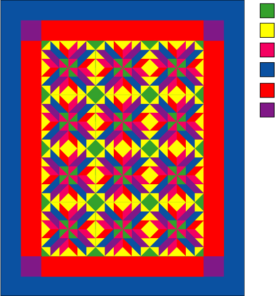
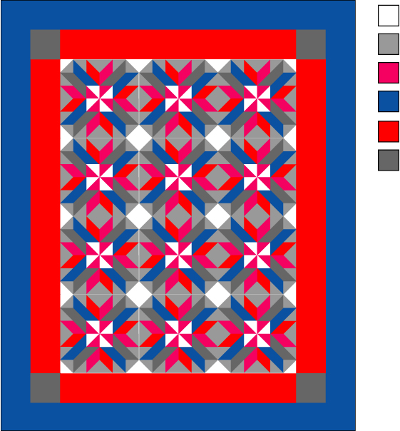
Below are two examples of digitally rendered quilt tops. The one on the left is a palette of all bright colors. Very overwhelming and distracting to the eye. The one on the right is the same quilt top with 3 of the color positions replaced with white, grey and charcoal.
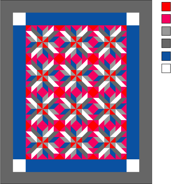
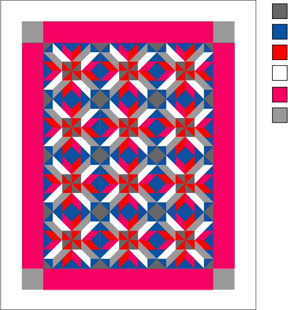
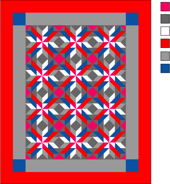
Now, let's take the same quilt top and the same colors but re-arrange them. Remember me mentioning proportion? Here are 3 examples plus the original:
Next time I'll talk more about finding sources of inspiration for color palettes.
Until next time, happy crafting!




 RSS Feed
